In a rush? Don’t like spoilers? /chart™ interactive graphic reviews will change your life. It’s like a trailer without the spoilers.
/chart™ is a revolutionary new way to evaluate the films in which you’re most interested. We developed a solution that lets us record the appeal of any film we’re screening in real time. We then compile the results and present them to you in a very straightforward and compelling chart format.
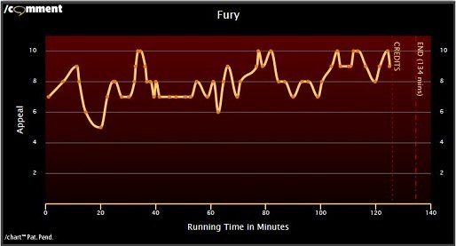
What’s it all mean? Let’s take a deeper look at a few examples to get an idea of our approach and how you can benefit from it all. Here’s the chart for 2014’s Fury:
 The appeal level ranges from 1 to 10 (represented along the left side of the chart). The running time of the film (in minutes) is shown in varying time segments along the bottom of the chart. The segment length will vary depending on the length of the film. The chart area itself shows us three key pieces of information. It shows the result of the chart data along with lines to let us know when the credits start and when the film actually ends. The background of the chart area also plays a part. The warmer the background, the higher our appeal. Each rating dot corresponds to a moment in the film when we felt compelled to record a response. What does this chart tell us about this particular film? It started off strong before beginning a bit of a letdown and then reaching its lowest point of a 5 at the 20-minute mark. Things then generally picked up, and something really engaging happened 33 minutes in. The film was good enough to take us to a maximum appeal (a rating of 10) eight times in just over 2 hours. That’s one heck of a ride.
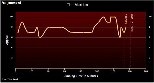
Now let’s take a look at the fun 2015 film The Martian:
 This chart gives us a totally different view. First of all, there are far fewer rating points. That means that the on-screen action kept us engaged at a fairly reliable rate, making for a much more relaxed experience. Everything was pretty interesting already when the film dramatically improved 96 minutes in. It kept us near the top until a major hiccup happened roughly 40 minutes later. What happened? That’s for you to find out. However, you can tell from the chart that it ripped me right out of all of the fun. On the plus side, it quickly recovered and ended on a solid note. Also, look closely, and you’ll see that there’s a final 8 rating that happened after the credits started. What’s that all about? Well, it tells you that something interesting happened during the credits and that I liked it. You might just want to stay in your seat a minute longer for this one.
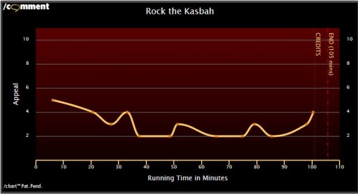
Next, let’s take a look at a film we didn’t enjoy — 2015’s Rock the Kasbah:
 It’s evident from this chart that not a whole lot about this film impressed us. Here, the long spacing between ratings tells a different story. The film was so boring that we nearly forgot to keep tracking it – definitely not a good sign. Bring lots of coffee. At least it ended on an up note — for anyone who bothered to stick around that long.
Room to Grow
I should also mention that this is a new feature. Our latest reviews will have a chart to go along with them, but older reviews will only get them once we have a chance to see them again and capture the responses. We may also provide the charts for films where we didn’t have the time to write full reviews to go with them. We’re also still fine-tuning the colors, layout and presentation so that the charts might change slightly as we evolve the concept.
A New Beginning
We feel that this gives the reader a new, novel way to look at and discuss the films in which they’re interested. Please take a moment to tell us your feelings about our latest creation.
